Porcelain and Light: Designing Serene Interiors

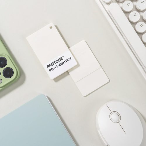
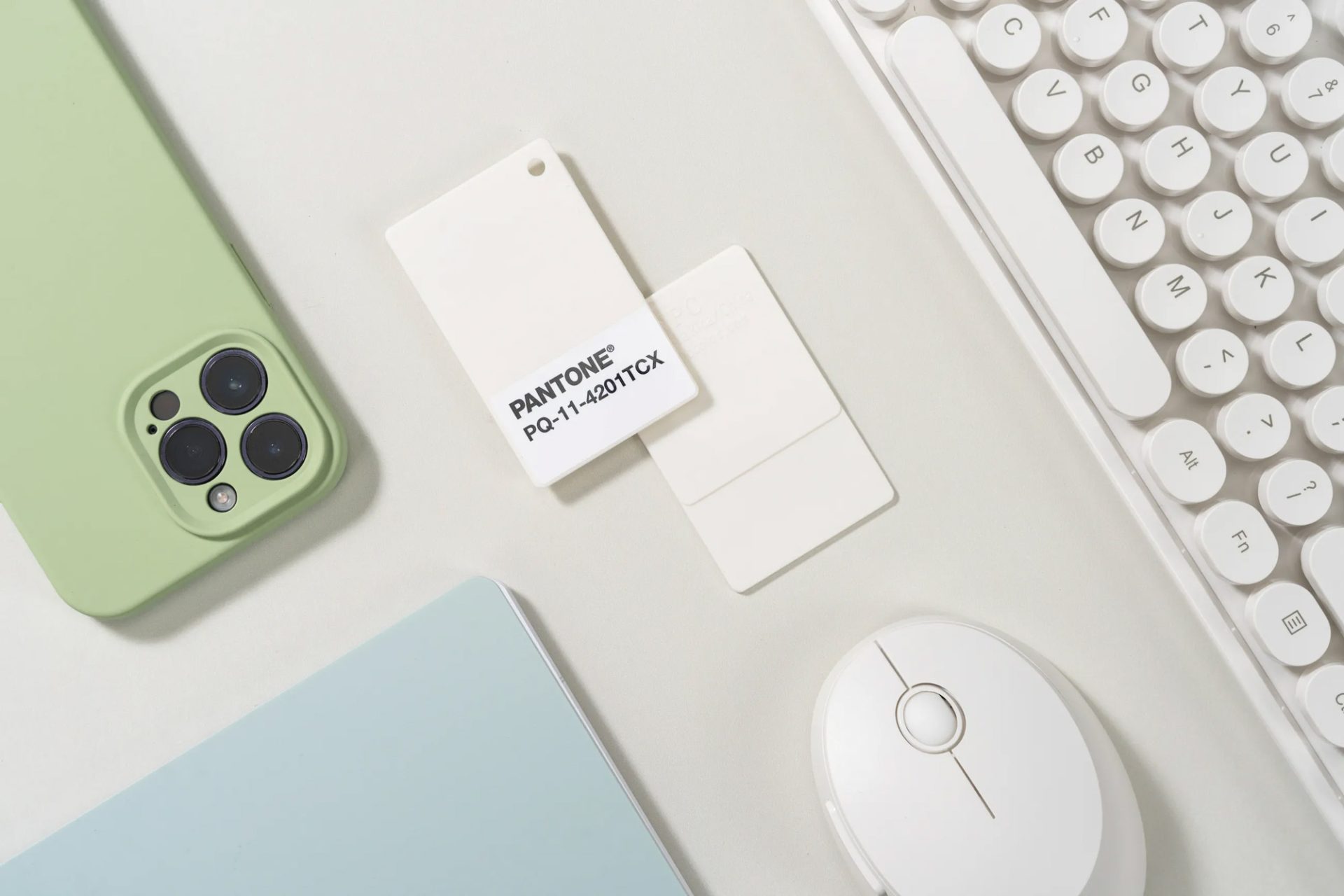
Pantone 2026 Colour of the Year – “Cloud Dancer”
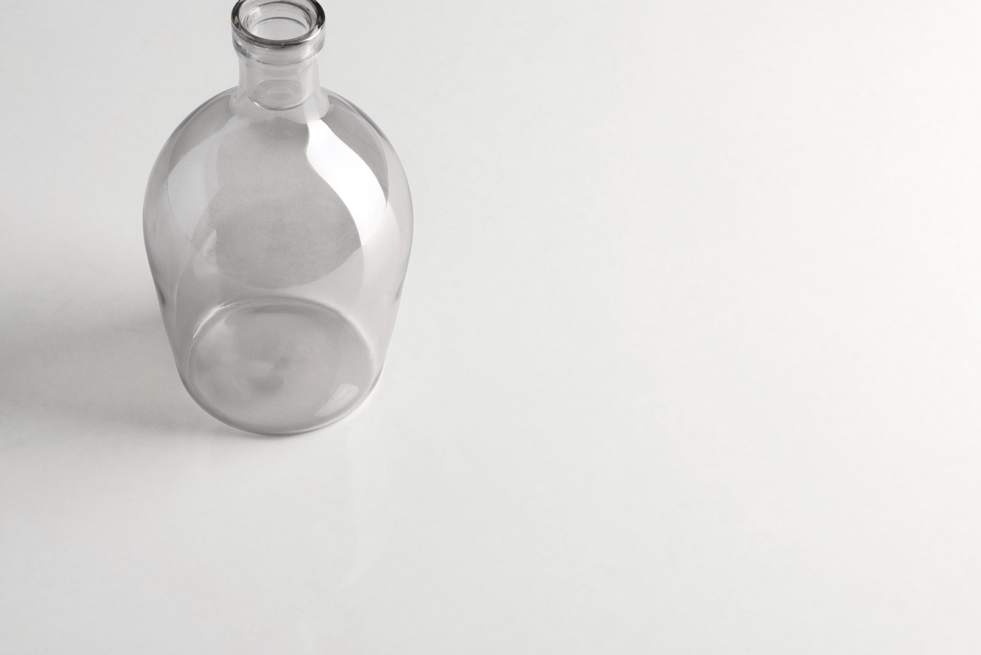
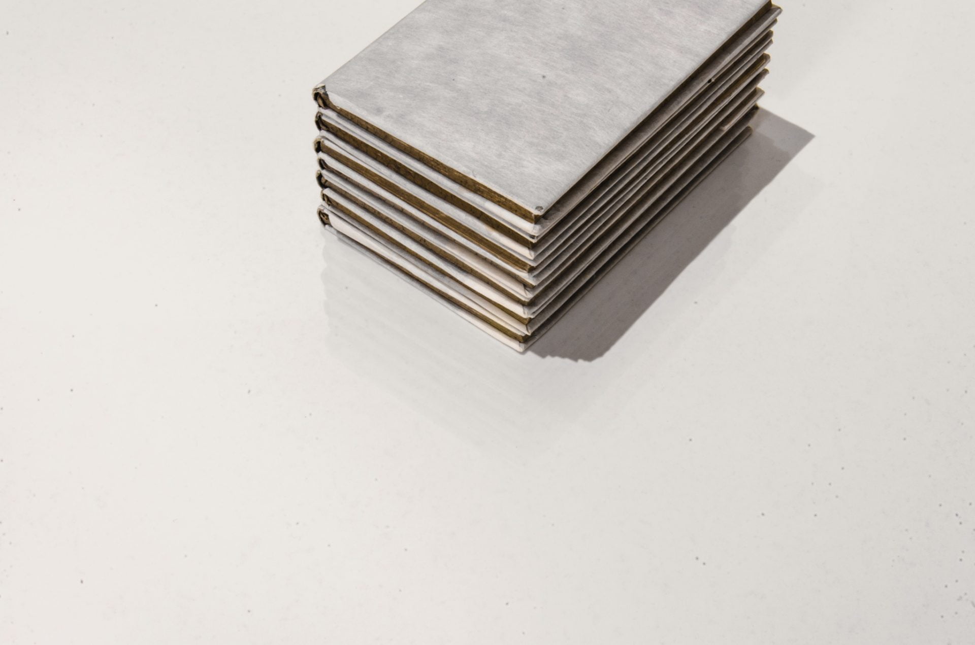
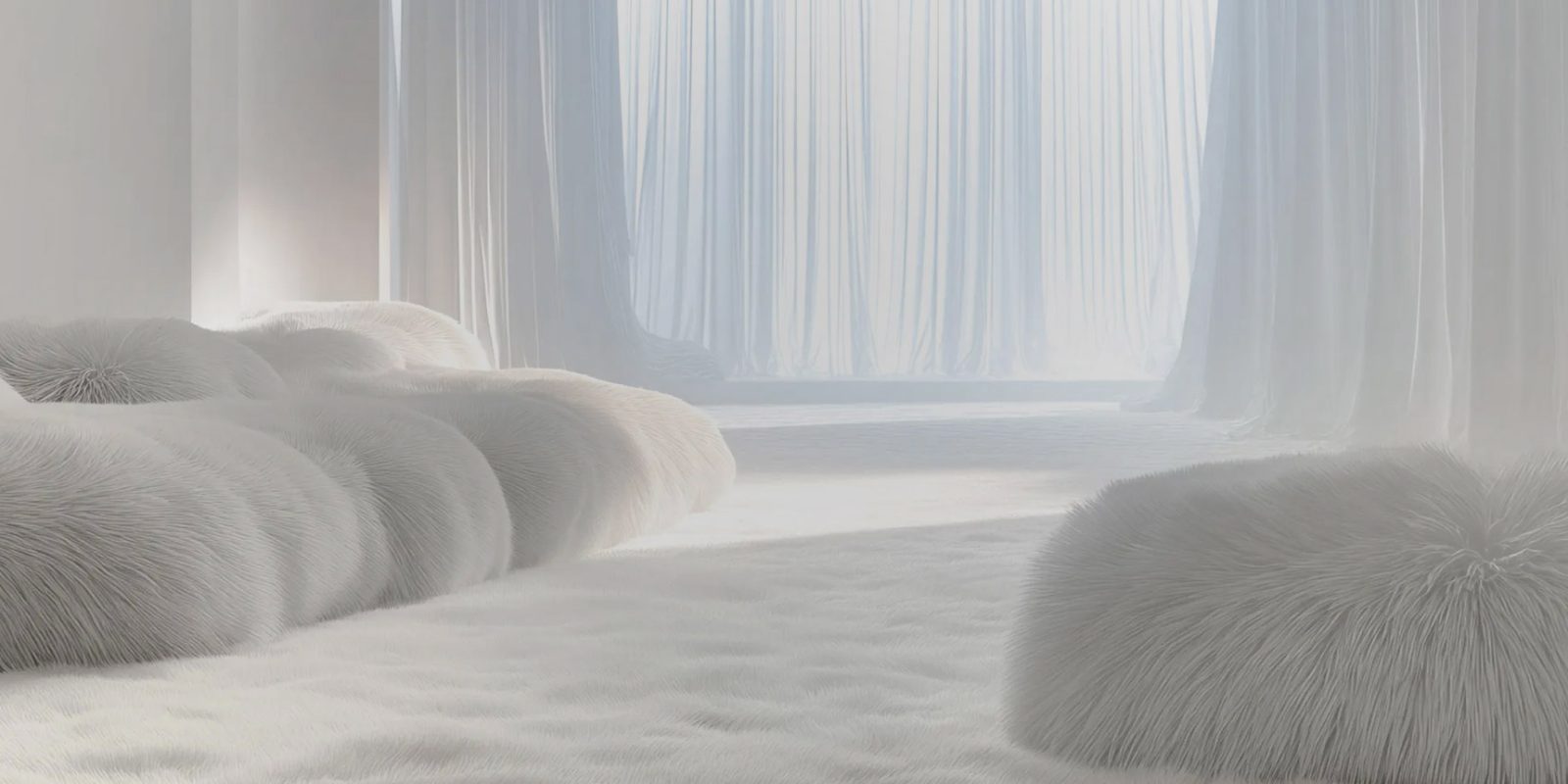
Every year, Pantone announces a Colour of the Year that sets the tone for design, fashion and interiors. For 2026, that colour is Cloud Dancer, a lofty, luminous white that embodies serenity, clarity, calm and quiet confidence. Soft and billowy in character, it reflects a collective desire for stillness in an increasingly fast-paced world. Interiors are transformed into sanctuaries of light, balance and wellbeing, inviting the mind to slow, breathe and reconnect.
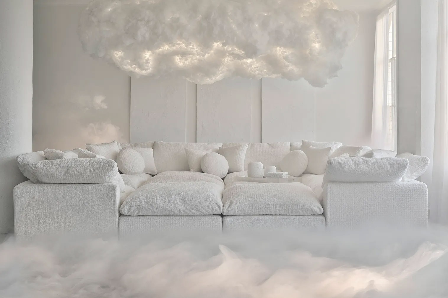
Photo: PANTONE x Joybird
A Versatile Foundation for Luxury Interiors
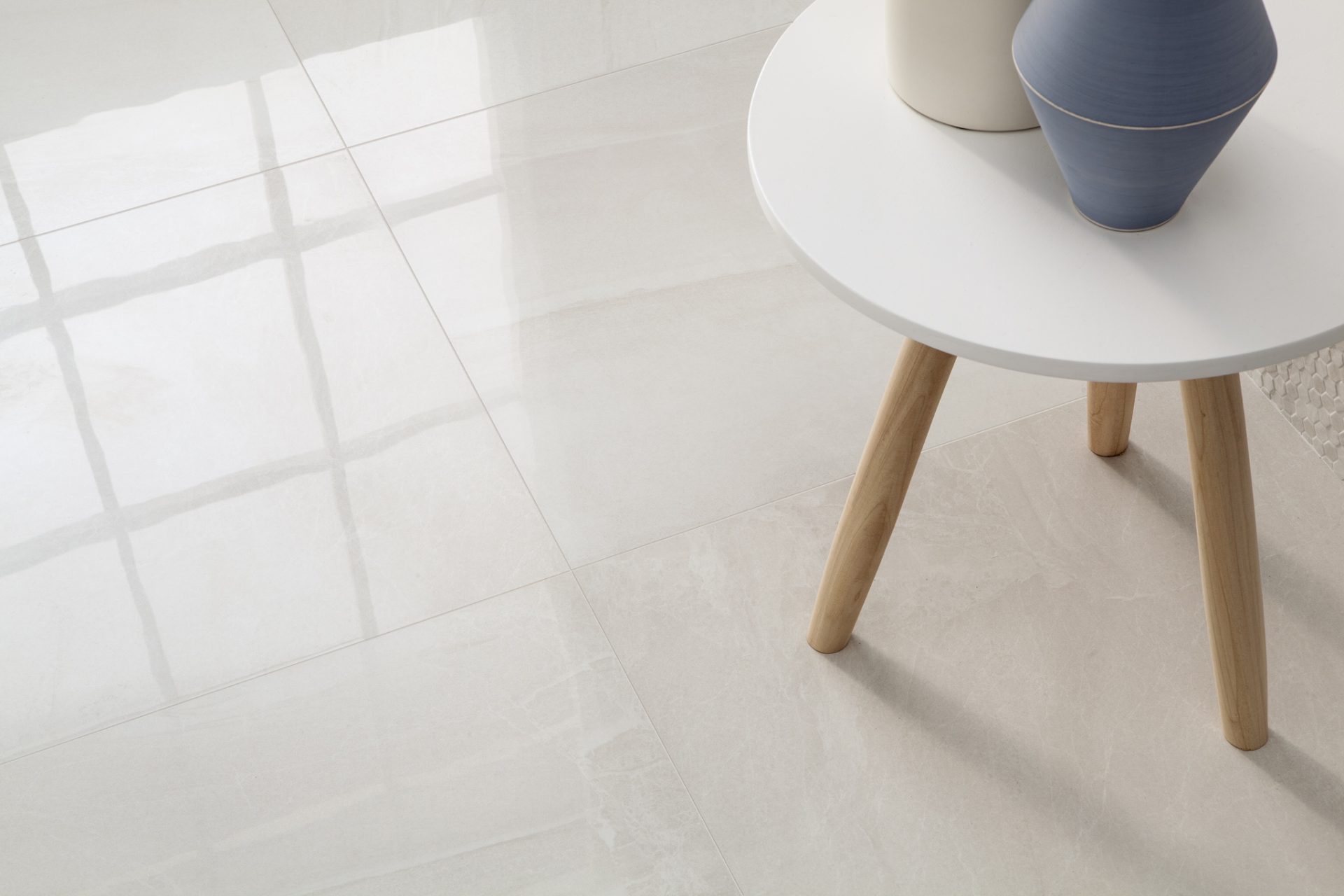
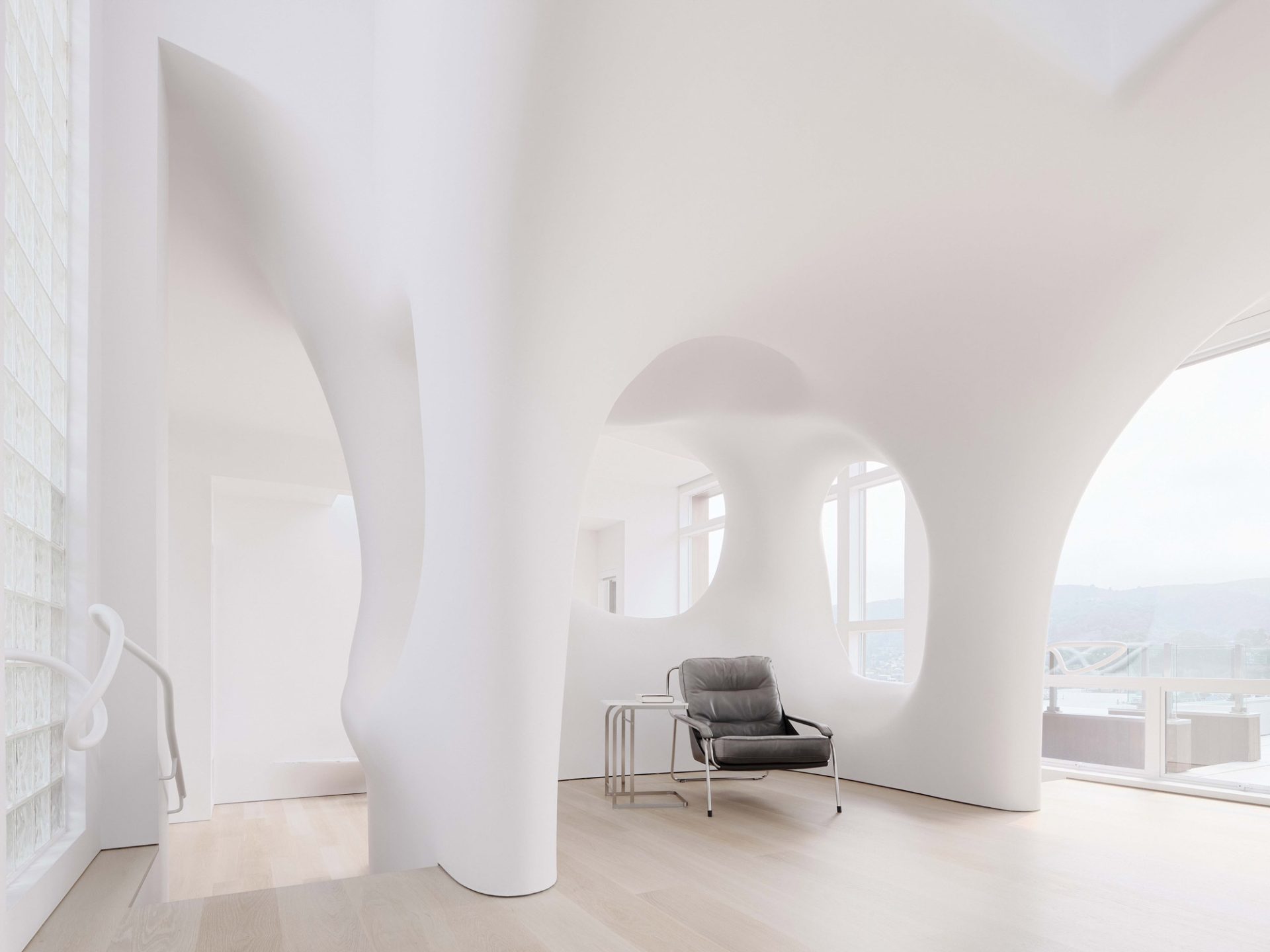
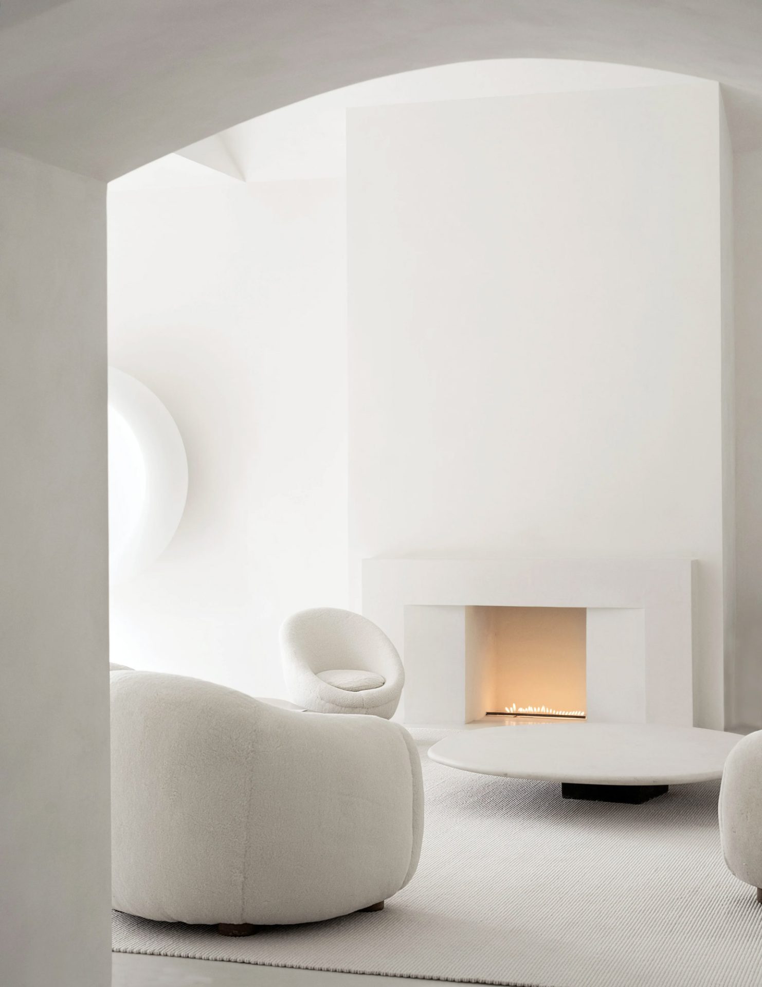
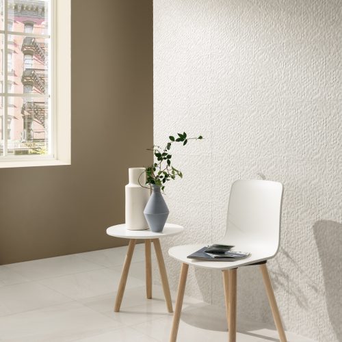
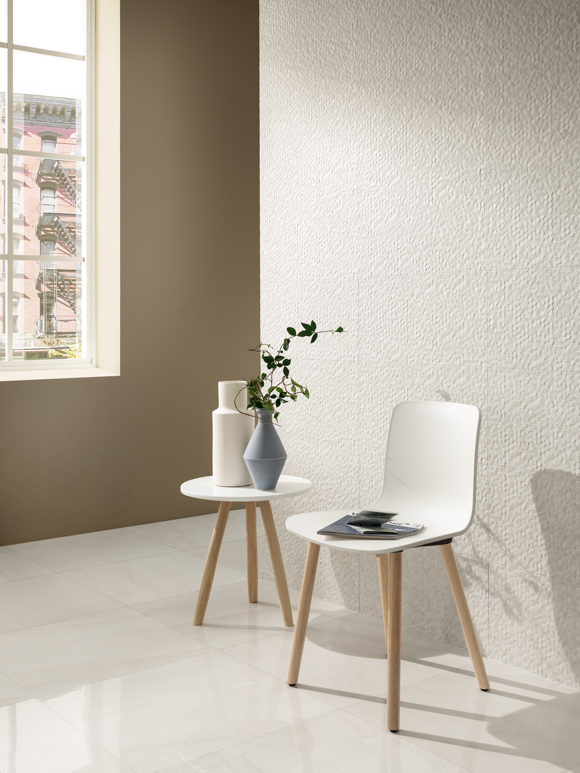
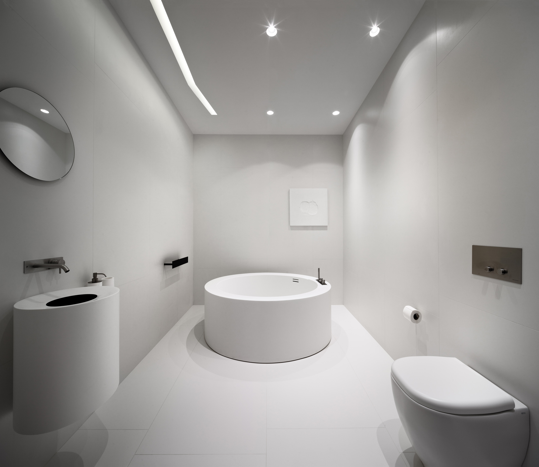
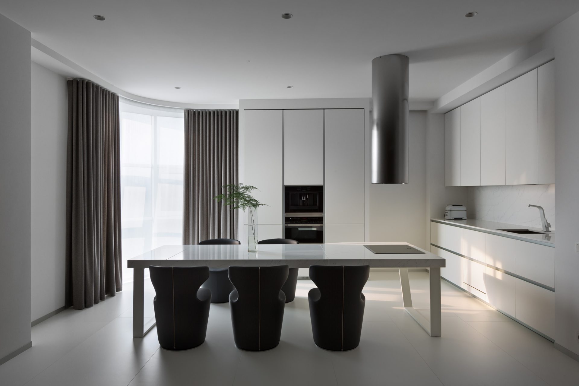
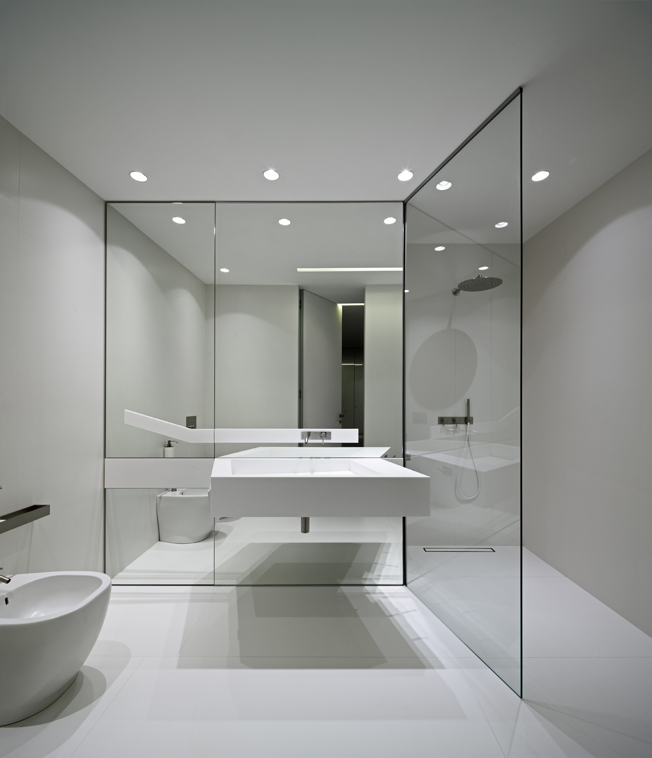
Ethereal yet grounding, Cloud Dancer is remarkably versatile within interior design. In residential spaces, it performs beautifully as both a primary backdrop and a delicate accent, bringing an airy openness to walls, ceilings and surfaces. Whether expressed through porcelain flooring, soft furnishings or architectural finishes, this refined white enhances natural light and gives spaces a fresh, expansive quality.
Paired with warm neutrals such as sand, stone and soft taupe it forms a gentle, harmonious palette that feels effortlessly elegant and quietly inviting. For a contemporary layered look, Cloud Dancer also blends seamlessly with softened hues and powdered pastels such as misty blues, muted greens, dusty greys and shadowed charcoals. Layered thoughtfully, these tones provide understated contrast and dimension without disrupting calm. The result is ideal for modern living spaces, boutique hotels and creative studios, where atmosphere and function coexist harmoniously.
-
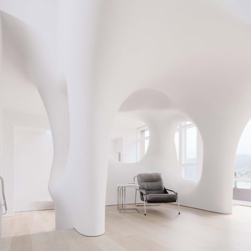
Photo: Joe Fletcher -
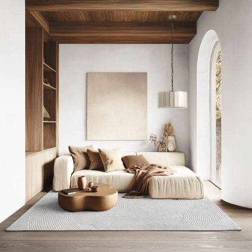
Photo: Industville -
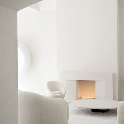
Photo: Architectural Digest

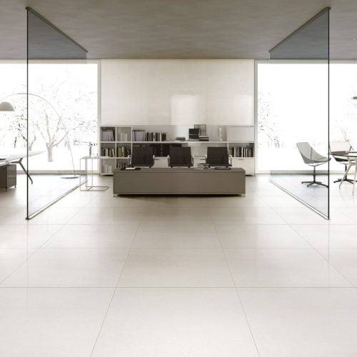
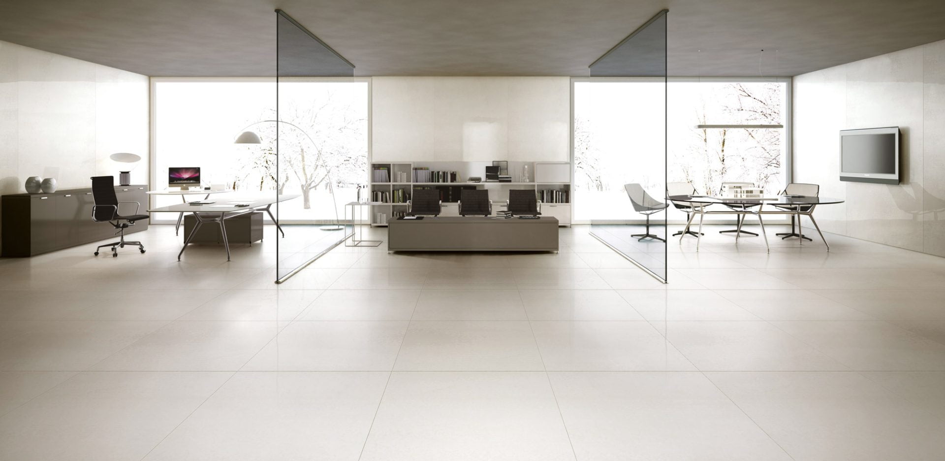
Bringing Serenity to Workplaces
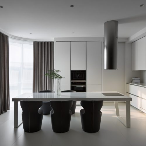
In corporate and commercial interiors, this soft white offers a refreshing alternative to colder whites. Its warmth supports focus, clarity and productivity while maintaining a welcoming and human-centred environment. In offices, meeting rooms and reception areas, it creates a refined, uncluttered aesthetic that encourages both collaboration and quiet concentration.
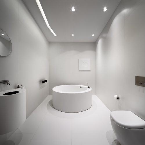
Cloud Dancer moves beyond colour, shaping interiors with clarity, calm and spaciousness. Whether featured as a striking foundation or subtle accent, paired with our porcelain tiles, it enhances light, texture and proportion. The result is an environment that feels open, restorative and refined – a space where elegance, balance and wellbeing coexist effortlessly.
-
Thassos by Ariostea -
PANTONE -
Geostone Bianca by Piemme
-
Ultra Iridium Bianco by Ariostea -
Ultra Iridium Bianco by Ariostea -
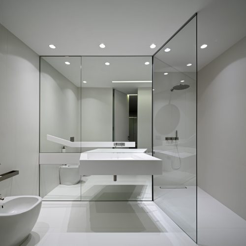
Ultra Iridium Bianco by Ariostea
-
Thassos by Ariostea -
Thassos by Ariostea -
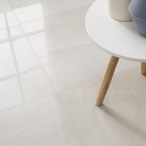
Geostone Bianca by Piemme